Case Study
How I Designed SPF Mötesglädje: a Non-profit Case Study
A look at the design process behind SPF Mötesglädje. National app helping seniors combat loneliness.
Fonts are one of the foundations of an accessible reading experience. The typeface you choose directly impacts how well users with visual impairments, learning difficulties, aphasia, and dyslexia can read your content.
The numbers are significant. 5 to 8% of people experience reading and writing difficulties, including dyslexia. 13% of the adult population struggles significantly with reading overall. Choosing the right font is not a nice-to-have. It's a responsibility.
Here are seven things to look for.
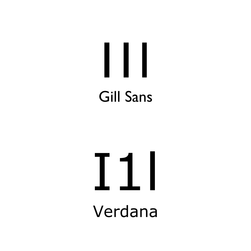
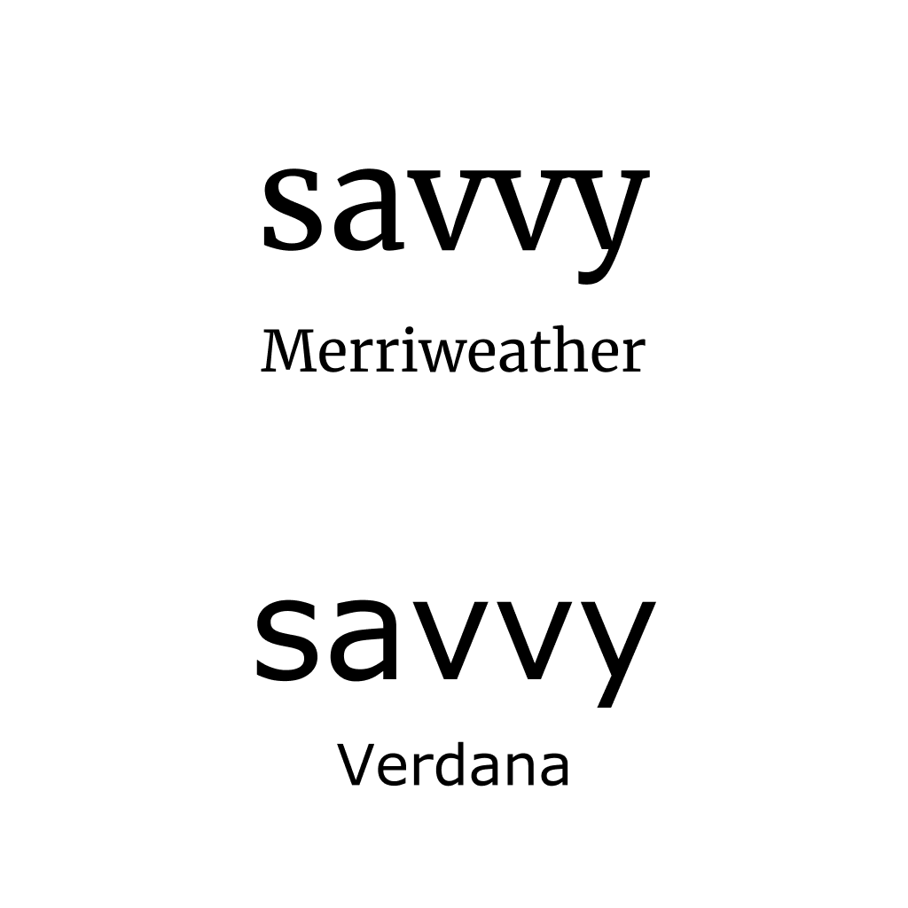
Characters like capital "I," the number "1," and lowercase "l" should be visually distinct from each other. Many popular fonts fail this test. Compare Gill Sans, where these characters are nearly identical, with Verdana, where each one has a clearly different shape.
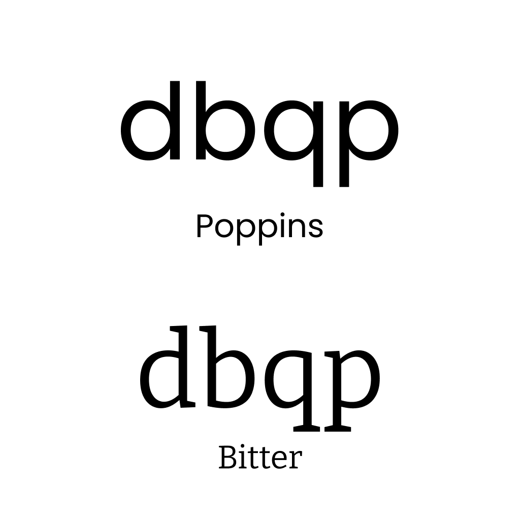
Your font needs to clearly separate letters like d and b, or q and p. Mirror-letter confusion is one of the most common challenges for people with dyslexia and reading difficulties. If these letters look like flipped versions of each other, readers will struggle.
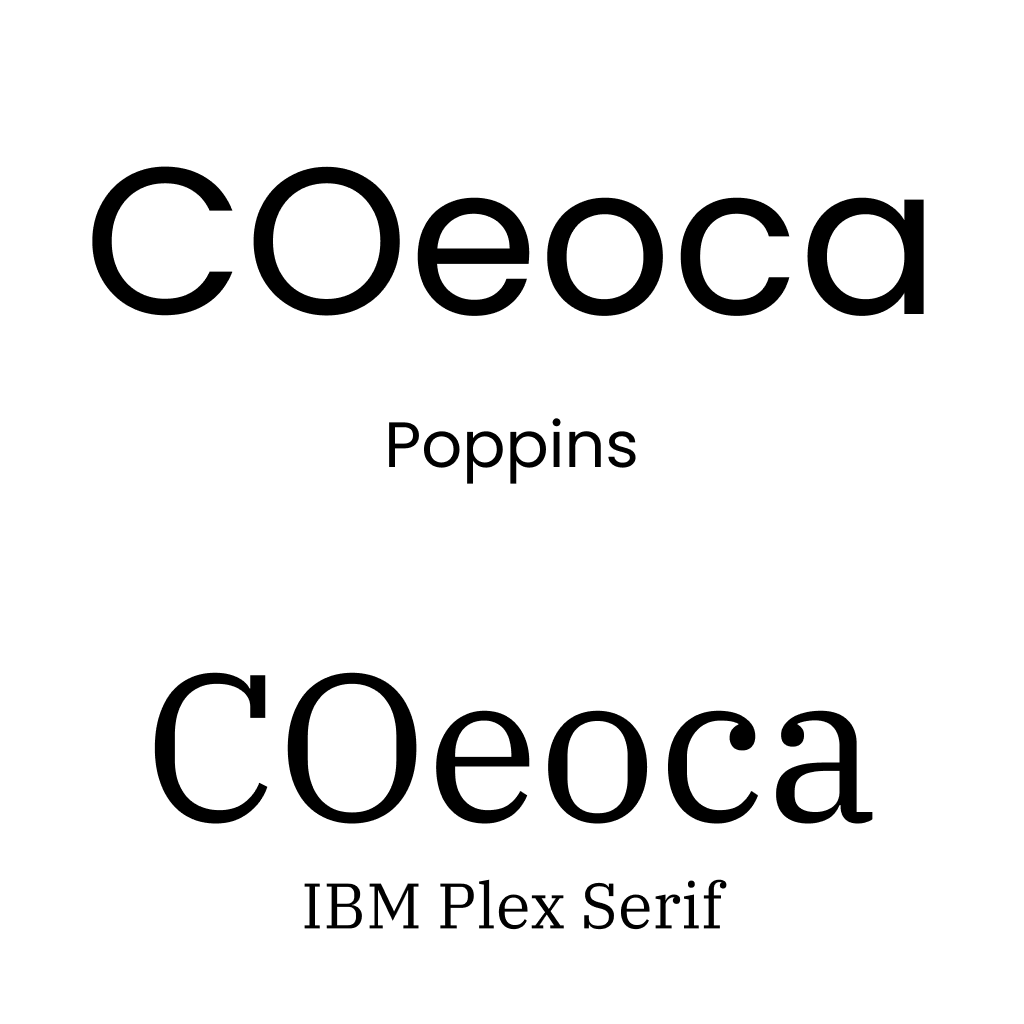
Letters like "o," "c," "e," and "a" need to be clearly different from each other. In some fonts, the "e" can look completely closed, and a "c" might be mistaken for an "o." If your users have to squint to tell letters apart, the font isn't working.
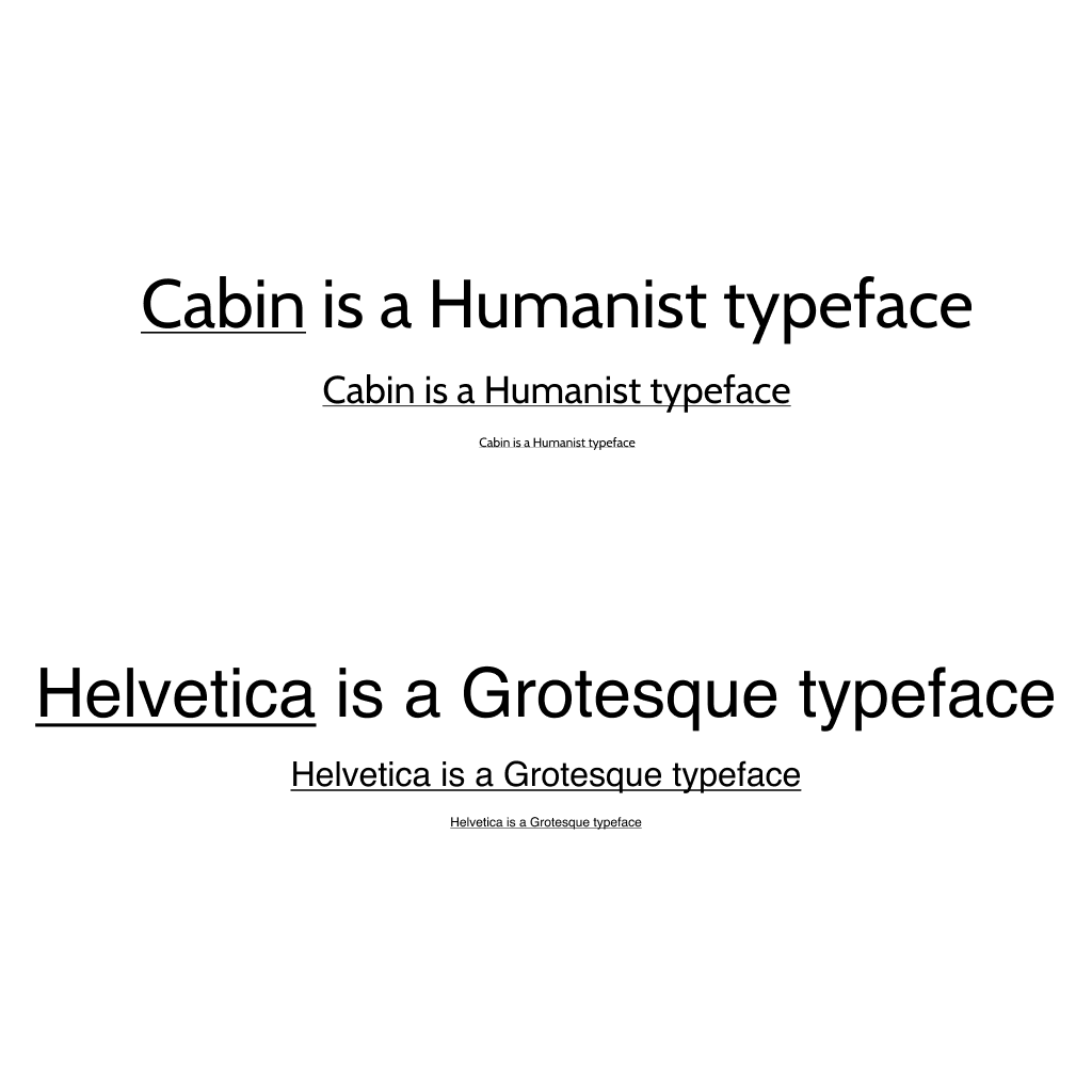
Humanist fonts show greater variation in letter widths, which improves character recognition. This is especially important at smaller sizes where subtle differences between letters can disappear in a more uniform grotesque typeface.
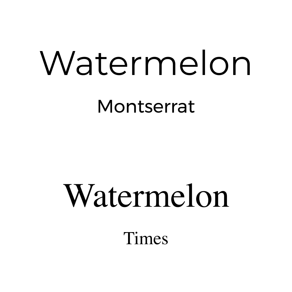
Tight spacing creates confusion. When letters sit too close together, combinations start to merge. "ol" becomes "d," "lo" becomes "b," and "vv" looks like "w." Good letter spacing keeps each character readable on its own.
The visual difference between uppercase and lowercase letters helps readers recognize proper nouns, sentence beginnings, and overall text structure. Fonts where these forms are too similar reduce readability.
Make a list of the users you need to include to cover your full audience. We recommend making sure your list includes people with dyslexia, aphasia, learning difficulties, and severe visual impairments. Then test your font choices with actual users in real content, not just specimen sheets.
WCAG contrast standards matter. 4.5:1 for AA, 7:1 for AAA. But here's the thing: if you choose a font with poor readability, it doesn't matter how good your contrast is. It won't help. Contrast and font choice work together. You need both.
Keep this on your desk. Run through it every time you're evaluating a font for a project.
Print this out and keep it next to your computer as a handy reminder.

Written by
Björn Rutholm
Founder of PixelPappa
Technical cofounder for hire. Product designer and developer helping teams build digital products that work.
A look at the design process behind SPF Mötesglädje. National app helping seniors combat loneliness.
You don't need months to find out if your idea works. Here's a step-by-step breakdown of the 5-day design sprint, and how it can save you from building the wrong thing.
The developer ecosystem is an absolute goldmine for designers. And most designers have no idea it exists. Here's how to start using it.
Insights, case studies, and updates from PixelPappa.